June 26, 2015
By Marius Brianski
Photos courtesy of Y Project
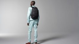
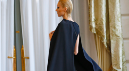
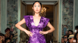
Paris, France – The brand Y Project collection for Spring/Summer 2016 mixes raw, futuristic minimalism with the current 90’s fad.
Although each piece looks simple, one can see some juvenile ruthlessness and dirt. There is an ugly, messy yet charming side of beauty. This is another visible trait that is the gender bending making the models look androgynous. The end result reminds a little the work of Rick Owens.
Creative director Glenn Martens loves architecture, especially gothic which is really visible in playing with shapes, structures and focusing more on the simplicity than decoration. The collection has some great coats, voluminous pants and tops. Unfortunately the whole thing is not fluid enough. One can see the creator has his likes and dislikes, but the whole thing became incoherent. The use of color and shapes gets mismatched, so some editing and working with the proper sets would be a good choice. We have graphically goth styles and trashy, colorful mixes side by side which isn’t a good idea. When it would be divided into 2 separates it would make sense.
There is a potential for growth, but some pieces look complex but some on the other hand just plain. The designer needs to take more time to consider what he is really trying to push to his potential client.
